fbpx

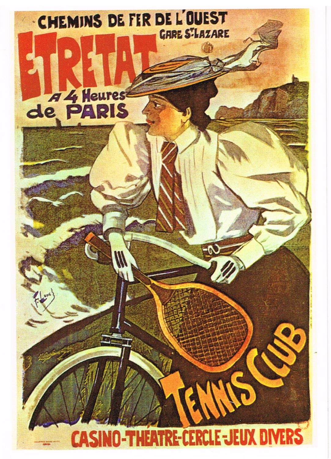
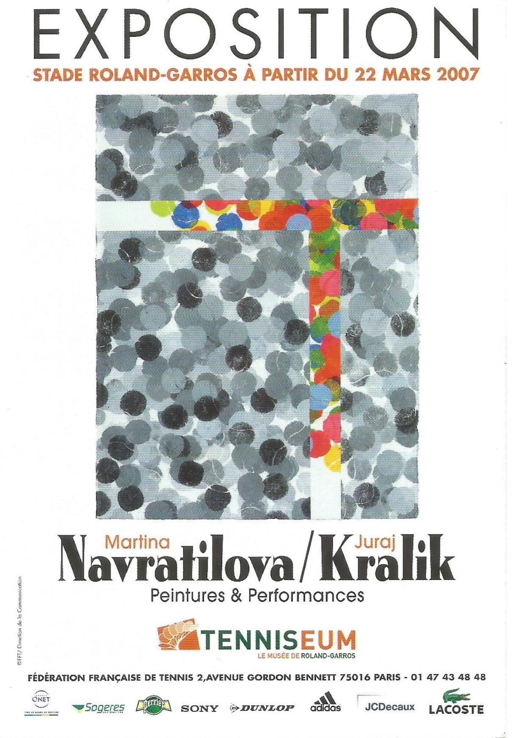
 Lacoste, Kontaveit and Leitmeritz:

The Crocodile’s razor-sharp fusionof sport

and fashion is an astute move.

© Radka Leitmeritz

Interviewing the player of the moment, Anett Kontaveit couldn’t have been more perfectly timed. After a meteoric rise, Kontaveit has risen to a career-high WTA singles ranking of world No.2 on 6 June 2022. She is also the highest ranked Estonian tennis player in history. A perfect muse, therefore, for Lacoste to launch their new Fashion Sport silhouette range via a photoshoot with world renowned fashion photographer Radka Leitmeritz. The shoot location was Indian Wells Tennis Garden, the self-named ‘Tennis Paradise’, a spectacular oasis in the Californian desert, where Kontaveit was competing. Leitmeritz and I met months later, at the 2022 French Open. 

2022 marks a creative shift for Lacoste, redesigning the feminine silhouette around fashion and sport to create the Fashion Sport range. Thanks to technical crafting, fashion pieces have been created with sports-inspired features. It is not only a lifestyle range merging the two cultures of sports and fashion, but also a collaboration between retro and modern. René Lacoste would undoubtedly be proud of his brand’s evolvement, by continuing his legacy of innovating, yet remaining true to its tennis roots.

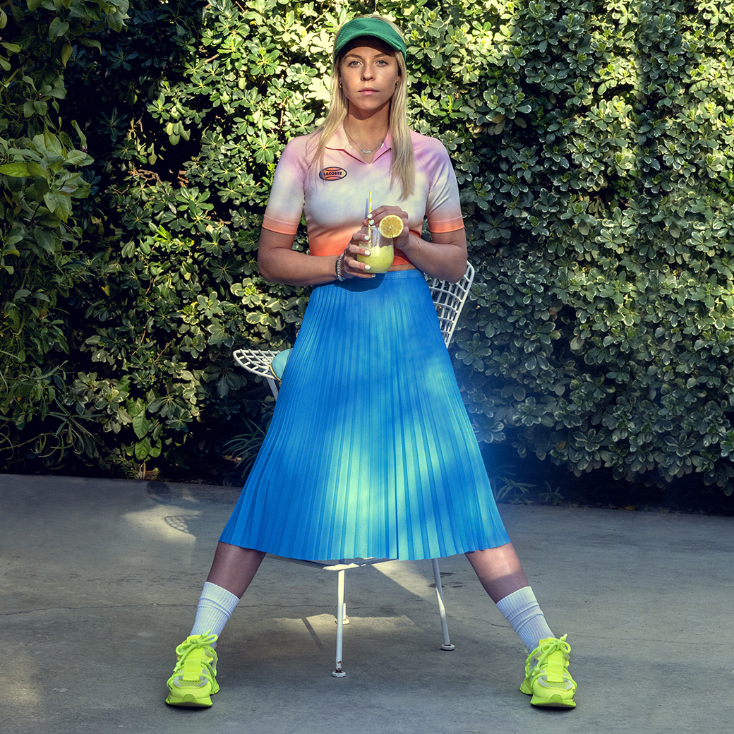
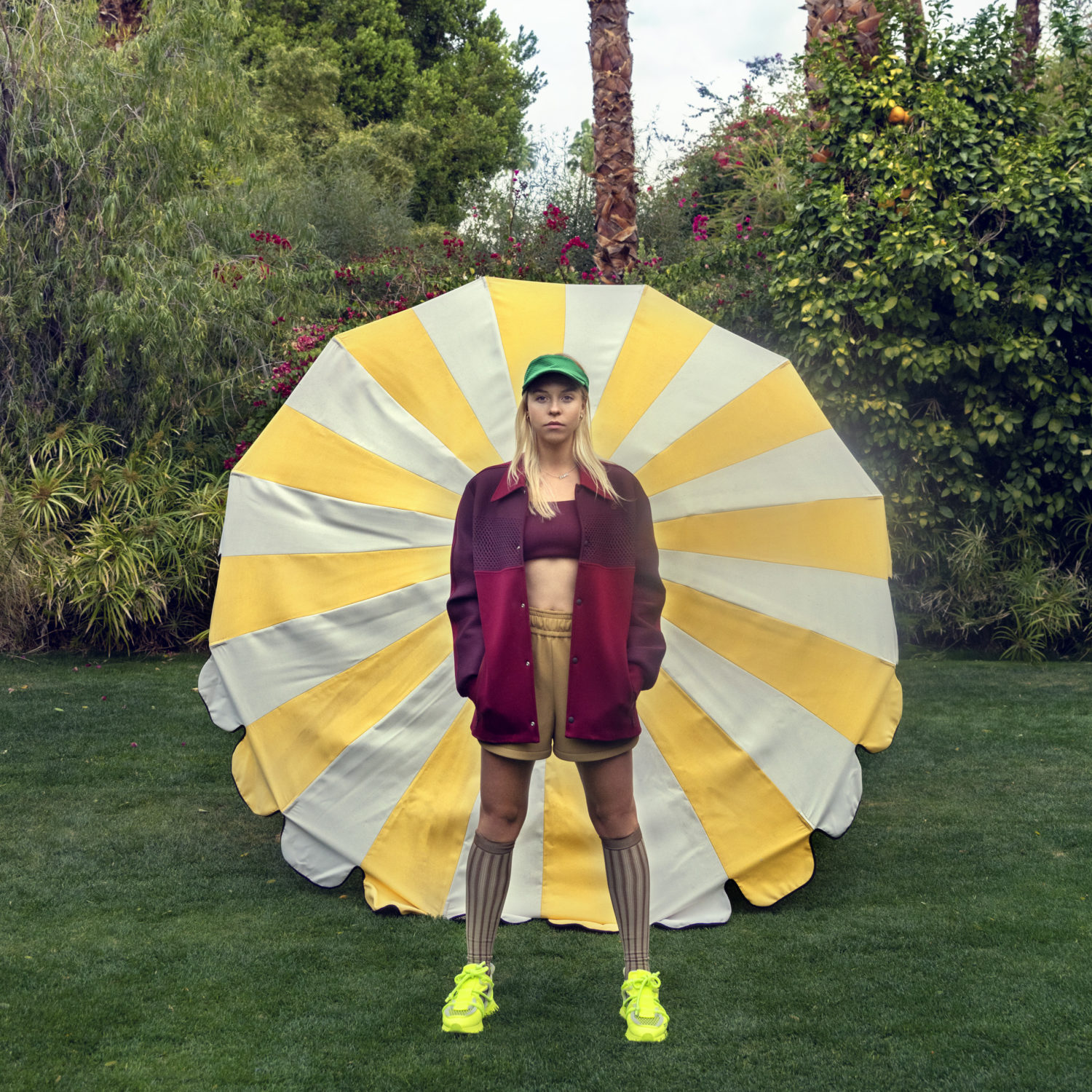
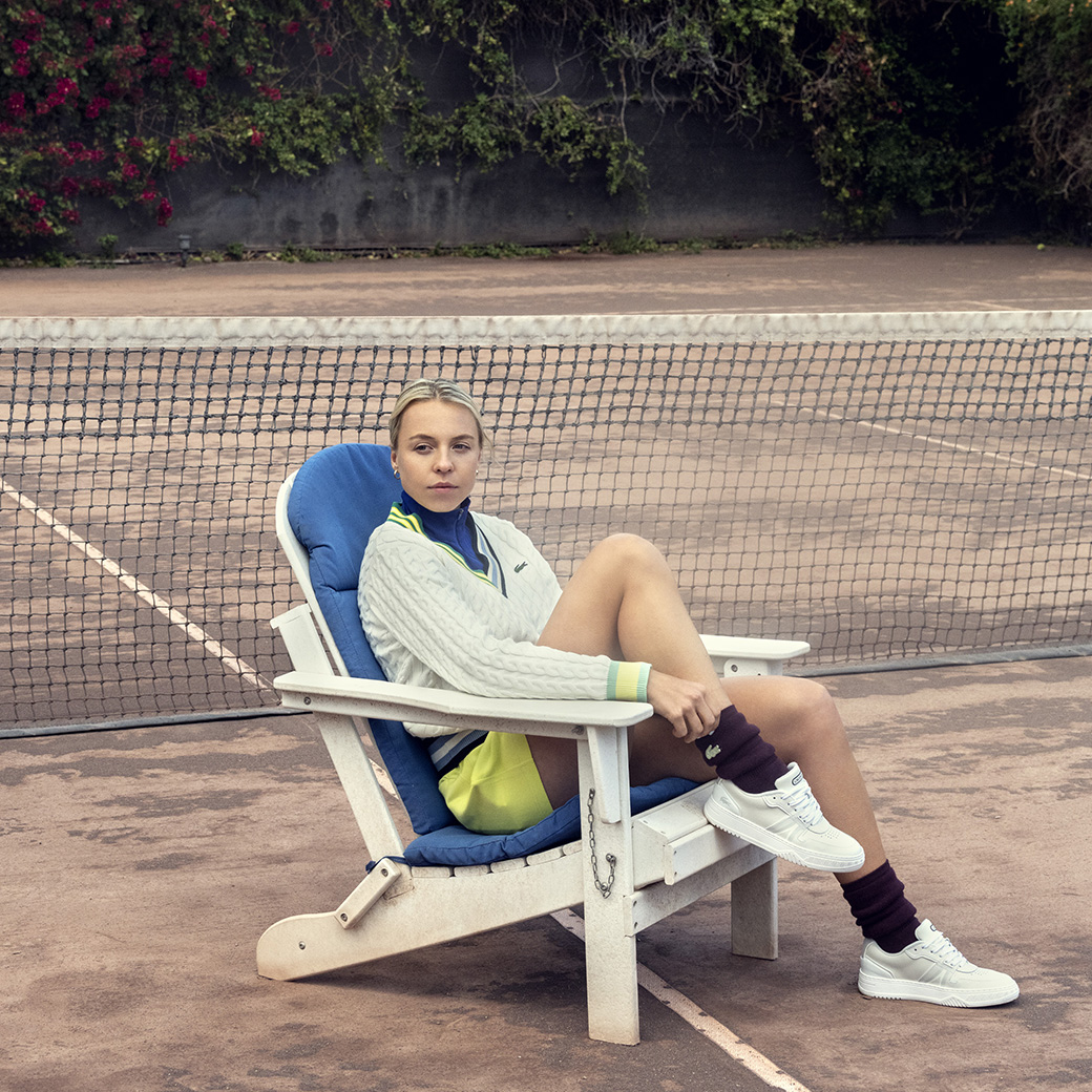
The shoot photographs are galvanizing, even if for the colours alone. In homage to Lacoste’s ethos, they showcase high-end fashion in a setting that could be from a bygone age. Kontaveit is presented with minimal makeup—the perfect canvas to showcase this colourful, bold collection, against an exotic backdrop of bougainvillea, and an ageing private clay court. The clothes are in vogue with their androgynous, oversized cuts. A chunky cable knit V-neck sweater in the collection is a nod to the past, but with a quirky twist: both sides of the V have contrast-colour stripes. A plum-coloured jacket plays with tones and textures, and is paired with chunky fluorescent sneakers, brown knee-high socks and a bright green sun visor. Colour is big: whether playing with ombré or colour blocking, pieces can be mixed and matched. Anything and everything goes, so throw away the rule book! This range is tailored for both the fashion-savvy and athleisure buyer. Designed to make a fashion statement, yet comfortable enough to exercise in—what more could anyone want? 

Having been sponsored by Lacoste since 2019 and with her love of fashion, Kontaveit is the right choice to showcase the range. We spoke about the Lacoste launch, and life both on and off the court.

© Radka Leitmeritz

Courts: Firstly, congratulations. You are the highest ranked Estonian tennis player in history. Your ranking continues to rise above the top 10, and now you are about to shoot this very special Lacoste Fashion line with world-renowned fashion photographer Radka Leitmeritz. Life is looking very exciting for you right now. Tell us more!

Anett Kontaveit: Thank you! The end of last year was very special for me, especially making the top 10 for the first time! Shooting with Radka Leitmeritz for Lacoste is a dream come true and such an honor. To say I am excited is an understatement. 


C: You are about to play at the aptly named ‘Tennis Paradise’ (Indian Wells). What a perfect place to launch this range. What piece from the range do you think encapsulates these surroundings, and which is your favourite?

A.K.: It’s tough for me to pick just one item because I genuinely love them all. The collection really matches the landscape at Indian Wells, it’s a beautiful complement to the setting we are in. Tennis Paradise really takes the athletic apparel to a new level. 


C: Your endorsement with Lacoste began in 2019. Before that you were with Adidas. Two very different brands, with very different silhouettes. What does the Lacoste brand mean for you?

A.K.: I am definitely very happy that I joined the Lacoste team in 2019. I love the clean lines and refined styles of their tennis apparel and have always been a big fan of their ready-to-wear collections. I grew up wearing the brand, and when I first started working with them, they made me feel like I was part of the team from the first day. I am very grateful for our partnership; we’ve been having a lot of fun. 


C: 2022 marks a creative shift for Lacoste, with the feminine silhouette completely redesigned to make sport more fashionable. What are your thoughts on this increasing trend of fashion in sport?

A.K.: I think it’s great! It’s important that we also look good and feel confident in what we are wearing. It’s obviously not the most important part of my on-court performance, but it certainly helps. 


C: Rene Lacoste was a true visionary. He was the first to feature a logo on the brand’s clothing. He also patented a shock absorber for the strings on his racquet in 1960 and called himself an “inventor”. If he were here today, how do you think he would view the visionary aspect of the brand?

A.K.: I hope that he would feel very proud! I think Lacoste has done a great job staying true to the original vision and look of the brand, whilst continuing to innovate and create a product that meets the current trends that we are seeing in athletic apparel today. 


C: Lacoste is associated with elegance and exclusivity yet is also fashion forward. There is the classic line (e.g. the polo shirts), but there is also a line that continues to attract a younger, fashionable clientele. Lacoste often has limited edition collaborations with brands of the moment, such as Opening Ceremony, Keith Haring and Supreme. How do you feel this new range embodies the Lacoste brand?

A.K.: I love that Lacoste has been doing collaborations. It keeps the brand fresh and exciting, while also attracting a lot of younger people who may not have considered Lacoste otherwise. It’s good to push boundaries and try new things! Of course, their polos will always be elegant and a staple piece in my wardrobe. They are a classic and something that I enjoy wearing too. 


C: In a 2019 interview with Lacoste, you said that you were into popular music with an upbeat vibe, like the song Levels by Avicii. What is your go-to song these days to energise or relax you before walking on court?

A.K.: My music taste is honestly all over the place, I listen to different music from Avicii to RnB. Songs remind me of important people in my life and special memories that I carry with me. It all depends on what mood I am in, and what I feel like listening to that day. Before matches, I usually listen to something more upbeat. It helps to get me in the zone and pumps me up! 


C: I understand that you have a creative side and enjoy pottery. What other artistic talents do you have, and can you see yourself designing your own range of tennis clothing one day?

A.K.: I wouldn’t say that I am a super creative person, but I do really enjoy pottery! I like studying, reading, and learning new things. Truthfully, I do not see myself designing my own range, I will leave that up to the professionals. I am happy to wear clothing designed by others! 

© Radka Leitmeritz

C: Luxury fashion brands are beginning to incorporate tennis into their collections. I know you like to wear some of them when off-court. Chanel, Prada, and Saint Laurent, for example, have branded tennis racquets. What is your view on this—do you think there is a market for luxury end tennis racquets?

A.K.: Tennis is growing all over the world! It’s a classy sport to play, so it does not surprise me that fashion houses and customers would gravitate towards luxury, high-end tennis racquets. I like seeing how the culture of tennis is infiltrating into popular fashion! 


C: The Lacoste Fashion Sport range blurs the boundaries between sport and fashion, making it versatile to wear both on and off court. What is your off-court style for daytime and evening?

A.K.: Much like my music, my style changes with my mood. Sometimes I like to wear jeans and a baggy T-shirt, and sometimes I like to dress up for no reason at all. It’s really whatever I am into at the moment. 


C: Which player, either from the past or present has best portrayed fashion and culture in tennis?

A.K.: Maria Sharapova is a good example. 


C: You have a positive happy outlook, always smiling. Your best friend Heidy once said in a WTA interview that you were always “kindhearted and upbeat”. What do you think is the secret to happiness?

A.K.: I don’t have the secret to happiness, but I know that the things that make me happy or that I seek out for myself are my freedom. Having good people around you that lift you up, encourage and support you, and make me laugh always help too! 


C: What has surprised you most about your career?

A.K.: It has taken me time to realize how strong I can be, and how much more I am capable of. I surprise myself every day. 


C: Who were your style icons, growing up?

A.K.: I didn’t grow up with a style icon or a tennis icon actually! I’ve always tried to remain true to myself, doing what feels right, wearing clothes that I like and make feel good. There isn’t one person in particular that inspired me. 


C: If you could help yourself to someone’s wardrobe, whose would it be, and why?

A.K.: Probably Blake Lively! Her red-carpet appearances have been amazing, she has amazing style. 


C: Tell us one thing about you that people would be surprised to know.

A.K.: I love cooking and my favorite meal to make for myself, friends and family are fish tacos. They are really good! 


C: What are the upcoming tournaments in your calendar that most excite you, and why?

A.K.: I am really looking forward to tournaments in Europe, I love the summer there. I’ve always enjoyed Stuttgart and Rome is one of my most favorite cities to visit, it also has one of the most beautiful tennis venues. And, of course, the slams in Paris and London are always very special. 


C: Can you walk me through your typical day routine, from breakfast to bedtime.

A.K.: Routines for a tennis player look different on training, versus tournament weeks. So, on a training week at home for example, I wake up, make myself coffee and a good breakfast and then head to tennis training right after. I typically have lunch at the courts and then either go to the gym or hit again. After training, I go home and rest a little, and take some time for myself. Sometimes I go out to dinner with friends or catch up with people I haven’t seen for a while, catching a movie afterwards, if possible. I make sure to always get a good night’s sleep, so I can wake up and do it all over again the next day. 


C: Many tennis players are superstitious. Are you, and if so, what superstitions or rituals do you have on court?

A.K.: My biggest ritual would be a braid that I make for every one of my matches. It’s like a lucky charm, I guess. But no, I don’t think I have any on-court superstitions. 


C: Looking to the future, tennis has entered the metaverse. The Australian Open released NFTs for the first time, Nadal, Osaka, Svitolina and Wawrinka are also endorsing NFTs. As the metaverse continues to narrow the gap between digital and physical reality, and art and tennis start to embrace this, what are your thoughts on the metaverse, for your own career as well as future showcasing of new Lacoste launches? 

A.K.: Technology and metaverse are definitely not my strong suit. But I do think the Lacoste Minecraft collection is very cool! 

© Radka Leitmeritz
© Radka Leitmeritz
© Radka Leitmeritz
© Radka Leitmeritz

Radka Leitmeritz

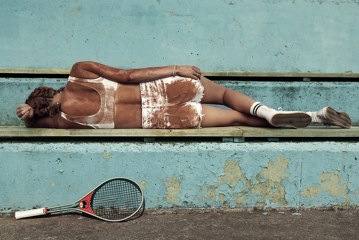
A few months later, I interviewed Radka Leitmeritz at the 2022 French Open. Lacoste’s selection of photographer couldn’t be more suitable. Leitmeritz’s foray into tennis photography has presented a unique lens through which we see tennis players. Her background is in fashion photography, having impressively shot for publications such as Vogue, Elle, and Harper’s Bazaar. An example from her portfolio is that of Petra Kvitova. Lying with her back to the camera, Kvitova is covered in red clay on a bench with faded, peeling paint, a vintage racquet propped up against the wall beneath. The photograph’s muted colours add to a timeless feel. Lacoste’s choice of Leitmeritz, was therefore a shrewd one. Together with her fashion and tennis credentials, Leitmeritz’s forte is to juxtapose vintage with modern. Much like Lacoste. 

Leitmeritz arrived at our meeting wearing a cap and t-shirt from her own brand Court Supremes (the name of her upcoming book, sponsored by Porsche). A stylish accessory paid reverence to her surroundings: a tennis-inspired silk scarf tied in a French knot around her neck, which she untied to show me the tennis racquet print across it. During our conversation, it became obvious that this is a woman in demand. Despite being interrupted by incoming calls and emails, the generosity of her time speaks volumes about how she does business. Leitmeritz’s openness and positive energy was infectious, even at the end of the day.

© Radka Leitmeritz

Courts: Your background is in fashion photography, with an impressive portfolio of supermodels and Hollywood A-listers as your subjects. You transitioned to tennis photography a few years ago, after taking an interest in playing tennis yourself. You have turned tennis’s superstars into magazine icons. What attracted you to tennis from fashion?

Radka Leitmeritz: I signed up for a tennis lesson in a park and got addicted, falling in love immediately. As a photographer, I see the world’s beauty through my camera. I took photos of people playing on public courts and was visually inspired. My first tennis assignment was to shoot Petra (Kvitova) for the cover of Elle Magazine. Elle knew that I had started playing tennis, so they called, saying, “we have something for you—with Petra. And you can do what you want”. I was very happy with this unique opportunity to bring a player into my world and treat it like a fashion shoot. 

Watching tennis, I noticed that nobody else was photographing the players in the way I envisioned. I see something totally different to what a sports photographer sees. Tennis players have such interesting characters, and the courts are a beautiful location. I began shooting old tennis clubs and courts, before collaborating with Racquet magazine. The WTA then approached me for a collaboration. We agreed tournament portfolios, portraits, and backstage photography—unlike anything that had been done before. But suddenly, the world was hit with Covid. My first series was when Indian Wells got cancelled, and everything was suspended for 2-3 days. The WTA and I decided to turn this into an opportunity, given the unusual situation where players had time, and nobody knew what was going on. Coming from a fashion background, I’m aware of styling shoots, so I started to bring props, like vintage racquets, or skirts, being careful not to clash with the players’ sponsor endorsements. Depending on the sponsor, I would bring some vintage Adidas or Nike, or even an unbranded item. I got great feedback!


C: From a fashion photographer’s perspective, what has been the main difference/challenge with shooting tennis players? Models and actors are used to being in photoshoots. But this doesn’t come naturally to a tennis player.

R.L.: It wasn’t that different. I found many similarities in these two worlds. Tennis players, like models and actors travel a lot. Many players have good fashion sense, with even better physiques than models because of their profession. But when attending my first tournament, I’ll never forget one major difference. In the players’ lounge at lunchtime, I saw female tennis players eating plates full of protein, carbs fruit, and they looked great, which was amazing. On modelling shoots I was used to seeing models snacking on carrots! There is a strong link between tennis and fashion. When I’ve styled a player for a shoot, they have appreciated that I will make them look better, as my approach is so different to the typical sports photographer’s approach. I gained their trust fairly quickly. 

Some actors are more comfortable with a moving camera, so still photography doesn’t always come naturally to them, either. So, the difference between the subjects isn’t actually that great. I just wish I could move better around the court to take my pictures. Tournament photographers have fixed allocated areas for shooting, which means that I can’t always shoot with the perspective I would love to, like lying under the tennis net! It’s hard to create something different. But it’s the ‘backstage’ access where it becomes more interesting, where I have more creativity outside of the tournament.

One-on-one moments with players are not easy to get. It took time to build trust and rapport, travelling with them for tournaments, becoming the familiar face at the breakfast buffet every morning. They understood that I was with the WTA and on their side, rather than a press photographer, so I was able to spontaneously photograph moments on a day off, or in-between matches. It makes a difference to have such unprecedented access to their life. But it wasn’t easy, the tennis world is difficult to penetrate. I had no tennis contacts, so I didn’t have immediate access. Thanks to the WTA’s support, it was made possible. They understood my vision and supported me. So, I was very lucky.


C: Your photos of tennis players are unique, merging tennis with art, often taken outside of the player’s normal surroundings. I love your photos of Petra Kvitova, covered in red clay, which you mentioned earlier. How did you manage to convince her to do that?

R.L.: Thank you! I guess because we were both crazy Czech girls, and we were in the oldest club in Prague, like home. And it felt like a sisterhood! I said, “hey Petra, I have a great idea. You’re going to hate me for it, but I want to roll you in the red clay”. And she’s like “alright, if you want, let’s do it!” You have to be lucky that it’s the right moment, the player’s in a good mood, open to experiment. Because not everybody is. 


C: Still on the subject of merging tennis with art, which players do you see as the best in portraying fashion, art, and culture in tennis and why?

R.L.: This is an interesting question because I don’t necessarily go for high-ranked players, or those who look like models. For me, every player is an interesting challenge because all have different characters. My job is to make everybody look good in front of my camera, whether it is a tennis player, or a lady working in the player’s restaurant, I’ll make my subject look good for a portrait. That beauty has to be personal, and different. It’s great if a player is open to being photographed. But I find players that are camera shy equally interesting and can often get something intimate. I had a great moment with Ons Jabeur. She had just lost a match but was happy for me to photograph her. These are precious moments because we are used to seeing smiling tennis players photographed with a trophy in their hands. But you rarely see photographs of players who have lost, and tennis is all about losing, only one person wins. For me, the challenge is to capture the losers too. I don’t just want to shoot the beautiful happiness of the tour. 


C: What does Lacoste mean to you, and how do you feel Kontaveit captures the brand?

R.L.: I’m truly excited about Lacoste. It’s hard to find a tennis brand with such good taste. Most brands today don’t have the same exclusivity or consideration for the physiques of all the players like Lacoste does, so we see so many players wearing the same outfits on court. Lacoste is selective about who they sponsor. Louise Trotter, Lacoste’s new designer has done an amazing job. She has really managed to turn a very conservative, posh brand with a little crocodile into a really cool brand. 

Lacoste is classic but with a modern touch. I follow fashion and love the fashion range. I was very happy when Lacoste approached me to shoot Anett, because I was able to choose looks from the fashion show and mix them with tennis. Anett looks like a model and understands fashion. Whatever I had wanted to do with her worked, but we weren’t so lucky with the weather on shoot day. There was a storm in Palm Springs which took out the light. Of the 2—3 hours we had, we only had 15 minutes of sun to utilize.

© Radka Leitmeritz

C: Looking at the photos, it’s hard to imagine those conditions that day, with the colourful bougainvillea in the background, and the muted colours of the court! Take us through the process for how you approached this shootcan you reveal your brief?

R.L.: The muted colours were due to the storm and lack of light. We were praying for beautiful light which we had for 10 minutes when we arrived on location, until the wind and clouds appeared. Everything was flying! So, when you see the photos of Anett standing in front of a parasol, it was literally used as an umbrella and reminded me of Tim Walker’s work (British fashion photographer), as he uses big, oversized props. So, although this look was unplanned, it was cool in the end, and we did a good job. We had lots of fun running in the storm, trying to make something from the situation that we had. You often have to improvise like this and work with what you have. I wanted to do something colorful and really bring out the retro aspect, and the location helped. I did a mood board for Lacoste, putting together some ideas and we chatted a bit, but it was basically really organic.


C: What are your favourite outfits in this new collection? You have previously said you wanted to bring out the romantic, visual, stylish side of tennis. 

R.L.: I love the knee high socks, which remind me of vintage Prada from the late 1990’s. I love the big chunky sneakers, the oversized jackets and the crop tops with the big, high-waisted shorts. And I love the technical materials which Lacoste have used, which you would normally think wouldn’t work, but it looks amazing. I wish people would wear this collection around tennis—perhaps before or after tennis. It would work in the lifestyle of the tennis world. 


C: I agree – we need more creativity in today’s tennis collections, which brings me naturally to my next question. Many sports photographers like something with movement during play (like a pleated dress or skirt). What are the best types of tennis outfits that provide the most dramatic results? 

R.L.: As a photographer, I never appreciate heavy patterns or crazy prints, which can hide the player. Some brands are too creative with their cuts for tennis players on court. They don’t understand the context or court surface that the dress will be in. Plain colours and a good cut are so important. I have said this in so many interviews, but I really wish the brands would work more closely with female players to develop a more individual style suited to the player, in the same way they do with the men. Rafa and Novak have their individual styles. Serena has had her outfits made for her. Sharapova had her ‘Maria dress’. But I wish that every female player who is endorsed by a big brand can create a little personal version of that brand’s collection. There’s nothing worse than watching two players on court wearing the same thing! It takes the personality of the player away, and you really have to pay attention to who is who if watching from afar.

Psychologically, it’s important for a player to feel good with what they’re wearing during a match. Imagine playing the semi-finals of a slam wearing something that doesn’t fit well or is not to your style. There are many elements to consider when designing for extreme athletic movement. A brand should elevate the personality of the players, which is missing on the women’s tour, so players often look like an army of athletes in identical clothes.

What Lacoste has produced is classy, chic and looks great on court. The colours work with the surface. It’s important for brands to understand that not everyone is lucky enough to watch tennis live. The majority will see the outfits through broadcast cameras or photography.


C: You did something very resourceful during the pandemic: a lockdown series, photographing tennis players via FaceTime on your iPhone. The results are impressive. Where did you get this idea from and how did you convince your subjects?

R.L.: Thank you. Many of us tried to be creative during the Covid pandemic. I follow players on social media and remember seeing their posts from their hotel rooms in Melbourne during the Australian Open hard lockdown. They were isolated for 2 weeks, unable to leave or open their windows, yet they had to prepare for the tournament by hitting a ball against a mattress propped up against the wall or biking in their bathrooms – crazy! So, I contacted the WTA, convincing them of this one-time opportunity in sports history. They liked my idea and contacted a few players who were happy to oblige, as they had nothing else to do. It was very special to be allowed into the intimacy of a player’s room, even remotely. Because not everyone that I had shot had met me before, until we FaceTimed. 

The WTA were initially concerned that the photographs would be a depressing depiction of isolation and loneliness, but the outcome was much more fun. I posted videos on my social media showing how we set up the shoots. We were laughing so much. Sometimes the players were alone, having to tape their phone using an overgrip against foam rollers if they didn’t have a tripod, with me directing them according to the light. When they had somebody with them in the room, I would direct that person like a DP!


C: From what you’ve just said, it’s clear that your job is as much about soft skills as it is about the technicalities. In an interview for Porsche Bucharest, you discussed bonding with Maria Sakkari over the Porsche design. How do you get the best out of people and what do you do to make a player you have never worked with feel comfortable?

R.L.: It’s an interesting question. I have the same approach for all my subjects. I try not to familiarise myself, so as to know as little as possible about the people so that I can make my own vision and picture. When you research too much, it can influence how you see them. I just go with my instincts and feeling, but I’m also very adaptable and open to work collaboratively. The player has to like what I do and feel comfortable because it’s about them. The clothes are a little touch to make the photograph visually organic. But I don’t want to change their personality or make them into creatures of my own vision. So, it’s important for me to try to help dress them in the way that suits their personality and what they’re comfortable with. I am honest, natural, and open with them in the same the way I’d be with a friend. 

Maria and I connected because she is a Porsche ambassador. Porsche is one of my project sponsors, so we both had an amazing experience together with the cars. Sometimes you connect with some people more than others. If you do portraits, you just have to find a connection. The subject doesn’t have to love you. But I do like to find something within my subjects that inspires me and helps me connect with them. 

© Radka Leitmeritz

C: I understand you are very particular about certain colours like the Porsche red, or Neptune blue for example. What colours do you like in this collection?

R.L.: I like the browns, Bordeaux, dark greens, yellows, and the weird, unexpected combinations. This is a very photogenic colour palette. It works with my colour treatment, which has been the same for many years because I come from the analogue photo generation. So colours for me are very important.


C: You often mix vintage with modern in your photographs. I’ve seen today’s players pose with vintage wooden racquets, or outfits. Is that why you think Lacoste chose you for this shoot, as the brand manages to retain its classic lines but also be fashionably progressive?

R.L.: I don’t know. I don’t think so, but I don’t think it’s about the vintage. I just think that certain things were just more beautiful in the past. Or maybe it’s the nostalgia of it. A white or wooden racket in certain contexts works better as a prop than a new racket from a modern brand, sprayed with weird colours. But a wooden racket can also be a cliché: sometimes it works and sometimes it doesn’t. Looking at the locations that I use and all the backdrops from an aesthetic point of view, sometimes old things just look better on camera than the modern stuff. Vintage props often tell more of a story. I’m attracted to retro in general. But we are living in 2022, so I don’t want to be stuck in retro and shoot people with vintage racquets. It’s important to bring modern aspects to it.


C: Your approach and style is very different to regular tennis photography, capturing the emotion rather than the action. How challenging is it to capture the right emotions and expressions on tour?

R.L.: Very challenging! It depends on many things. I’m not looking to shoot a player’s backhand, but I’m looking to have a moment with the player. Those moments can be during the changeover when the player grabs a towel, or on the bench deep in thoughts, for example. So, you have to be patient because maybe the moment never happens, or the light or positioning is poor. At the French Open, the location of the photographer’s pit on court is great because you are so close to the players. But you have to be lucky because the emotion has to come from a moment you’re trying to capture, which doesn’t happen on command.


C: You’ve previously said that your work is inspired by movies. Which film, book or artist has inspired you the most?

R.L.: The 1960’s film Blow Up has an inspiring pantomime scene in a park full of tennis courts. There is something fascinating about abundant tennis courts. I love clay courts, as they look like a battlefield: a ‘before’ and ‘after’ battle scene, which has a very specific energy. The film Belle de Jour, has a beautiful scene with Catherine Deneuve, wearing tennis whites, with a headband, in the 1960’s in a posh tennis club, it’s a great look.

The fashion photographer (and tennis lover) William Klein is also an inspiration. In the 80’s, he created a documentary about tennis’s golden age called The French. It’s beautiful because it was made with all those iconic players and beautiful tennis looks of the 80’s, and shot in 35mm film, so everything has a cinematic quality. The camera angle access he had would be unachievable in today’s broadcast tennis, which has specifically allocated camera angles. Klein was able to film wherever he could on court, so the sound is unbelievable. Back then, you could interview or photograph players in their locker rooms, with their coaches smoking cigarettes whilst speaking to the player and journalist!


C: What is your best court surface to photograph, and which tournaments are you looking forward to shooting at this year?

R.L.: The French Open has been my dream court surface to photograph for two years, so it’s exciting to be here! The next one will be Wimbledon which I’m also excited about, because we need some green also and some tennis white!


C: How do you think the metaverse will affect tennis and fashion photography? The Australian Open and Roland Garros have released NFTs for the first time, Nadal, Osaka, Svitolina and Wawrinka are also endorsing NFTs. As the metaverse continues to narrow the gap between digital and physical reality, and art and tennis start to embrace this, do you see yourself branching into this new world?

R.L.: It’s a very interesting question because this is a topic that I’m thinking about a lot. My Court Supremes book project will incorporate NFTs in some form, but I don’t want to speak about this just yet, other than to say that it gives sense to everything digital, especially for art collectors. As for the metaverse, it is far away from the reality, so I still don’t know how to approach it. I have mixed feelings about it because I still want to be in the real world. 


C: Finally, tell us about your soon to be published tennis photography book, Court Supremes?

R.L.: Court Supremes is a book sponsored by Porsche, which we are hoping to publish in 2023. It will be the first book dedicated to the beauty of women’s tennis, including tennis courts and player portraits. I’m hoping that it will be a beautiful coffee table book. It will focus on women’s tennis, because I feel that the men’s tour has enough attention, and that equality between men’s and women’s tennis is still to be achieved. Women still have less tournaments than men, some tournaments still don’t pay equal prize money, so I want to support women’s tennis. The book is a gift to women’s tennis and its beauty. 

There are still very few female tennis photographers on tour. Right now, we’re in the Media Centre at Roland Garros. How many women do you see here? Very few as it’s a male-dominated profession. I wish there’d be more women. Photographs and editing would look different taken from a female point of view, with a little more sensitivity around some of the angles and expressions that women would not want to show. I’m not trying to change the world of tennis sports photography. I appreciate that I am stepping into somebody else’s world, so I’m just trying to bring my own angle to it. It’s a sports journalism versus fashion art world—two worlds that cannot be compared.

As we wrap up, and before Leitmeritz leaves, she says something unprompted that leaves me on a positive high, staying with me for the rest of the day: 

“Since I was 19, I’ve learned that I got into photography intuitively because I attracted to it with all my heart and loved it. It was not calculated. I really believe that whatever you choose to do in your life, no matter where you come from, you can do it if you are inspired. I had the same approach when I went from fashion to tennis photography, and doors opened for me. Everything is possible. What you choose, wherever you come from, whatever you do, it doesn’t matter. When I started in tennis, many people questioned my choice. My answer was always the same: I felt inspired. Do whatever inspires you, whether it be photography, writing a book about tennis, flowers, dogs, or animals. Follow your inspiration with your heart and doors will naturally open for you because people feel that positivity. I’m saying this right now because I’m reminding myself about it!” 

Richard Gasquet, talent caché

Gasquet, À revers et contre tout, aux éditions Stock

Le 18 mai, quatre jours avant Roland-Garros 2022, Richard Gasquet a sorti son autobiographie : À revers et contre tout. Racontant son histoire à Franck Ramella, qui l’a mise sur papier, le Français a notamment révélé à quel point il a toujours eu du mal à être le centre de l’attention. Ce qu’il a été après seulement quelques années d’existence, dès ses 7 ans.


« Richard Gasquet est un personnage de roman. »

Avec son sens de la formule, Franck Ramella, plume guidée par les récits de « Richie » pour rédiger son autobiographie, a résumé à merveille la vie de l’intéressé. Et elle a d’abord suivi les lignes d’un roman d’anticipation. Dès ses premiers pas dans le tennis, on a écrit la suite de son histoire : le prodige était né pour remporter un titre du Grand Chelem et devenir le successeur de Yannick Noah. « Richard G., 9 ans, le champion que la France attend ? », titrait Tennis Magazine en Une dès 1995,  avec une photo d’un gamin haut comme trois pommes en pleine exécution d’un revers à la technique touchée par la grâce. Un don semblant tombé tout droit du ciel, comme offert par les divinités du tennis et censé faire de l’enfant de Sérignan leur envoyé sur Terre.

Seul hic, au fond, le génie n’aurait peut-être jamais souhaité sortir de sa lampe. Il aurait voulu rester chez lui. Dans son monde. « De trois à treize ans, j’ai passé toutes mes journées dans un périmètre de deux kilomètres carrés, a-t-il expliqué au cours du chapitre retraçant son enfance. Je n’ai rien fait d’autre, je ne voulais rien faire d’autre : PlayStation, stade (où il jouait au foot et au rugby avec les copains, ndlr), tennis, école. Très vite, après mes dix ans, j’ai dû partir disputer les championnats nationaux ou des compétitions internationales de jeunes. La plupart du temps, je ne m’y sentais pas bien. Je voulais rentrer le plus vite possible. Pourtant, il n’y avait aucune raison pour moi d’être mal à l’aise durant ces voyages : je ne perdais jamais chez les jeunes. »

« En 1999, je remporte les Petits As à Tarbes, la plus grande compétition internationale de jeunes, en battant un certain Rafael Nadal en quart de finale, a-t-il poursuivi. Après cette victoire, je me souviens m’être immédiatement dit : “Super, le tournoi est fini !” La suite, je n’en avais plus rien à faire. La seule chose qui m’importait, c’était de rentrer en voiture le soir même pour être sûr d’être au stade ou sur le court à Sérignan le lendemain. » De quoi donner, aussi, à son histoire, des similitudes avec un conte de fée. Celui du Petit Poucet. À l’instar du héros immortalisé par Charles Perrault, l’Héraultais a toujours voulu revenir à la maison. Mais plutôt que de laisser des cailloux blancs derrière lui, il a semé des revers immaculés partout où il passait. Un geste-signature qui a fait l’objet d’un chapitre. Obligatoire. 

Le premier du livre, intitulé « Revers gagnant », et suivi de : « Paris Match, le poids des maux » – dans lequel est confié qu’en 2004, en plein désarroi, il a voulu tout arrêter et a demandé à son père de lui trouver un stage à Paris Match – « Sérignan », « Maryse et Francis (ses parents, ndlr) », « 2002, année de feu », « Mon Nadal à moi », « Oui, j’ai cru au titre du Grand Chelem », « Génération mousquetaires », « L’affaire », « Seb (Grosjean) et Sergi (Bruguera), juste un peu tard », « BIG 3, le mur », « Forget, Capitaine Fracasse », « La pire défaite de ma vie » – sur la défaite contre Roger Federer en finale de la Coupe Davis 2014 -, « Sarkozy – Noah, mes mentors de l’extrême », « Drôle de goût pour mon plus grand titre » – à propos de la Coupe Davis 2017 -, « Une vie de saltimbanque », « Jeune surdoué et senior avisé », « Ce qui m’a manqué n’est pas ce que vous croyez », « Moi, pas de mental ? » et « Aider le tennis français. »

Richard Gasquet, Roland-Garros 2010
Richard Gasquet, Roland-Garros 2010 (© Ray Giubilo)

« S’il y a un joueur qui peut presque légitimement se plaindre des médias, c’est Richard Gasquet »

« C’est plutôt moi qui a amené les sujets des chapitres au cours des entretiens, a détaillé Franck Ramella. L’éditeur (Stock) intervient dans certains choix, et il voulait, bien entendu, un chapitre sur le revers, ce qu’on aurait fait de toute façon. C’est à la fois un livre grand public, et un livre qui doit plaire et apprendre à ceux qui aiment Richard Gasquet. C’est aussi la difficulté de ce genre de chose, il faut être assez simple pour que ça intéresse les gens un peu nouveaux, tout en apprenant des trucs aux fans. Et j’ai pris le parti de ne pas raconter à nouveau des matchs, parce que je pense que ça ne sert à rien, sauf si le souvenir en est étincelant. L’idée était de se baser sur des périodes, puis les chapitres se déclinent. Par exemple, ça a été au fil de la discussion qu’on a vu qu’il avait des trucs à dire sur Forget. On a vraiment eu une liberté totale pour les chapitres. »

Journaliste à L’Équipe, où il est arrivé en 1989 en tant que secrétaire de rédaction stagiaire, Franck Ramella a toujours été un fondu de sport et d’écriture. Si, dès l’enfance, le petit Richard avait déjà du style grâce à ses figures de revers blanchissant les lignes, le jeune Franck noircissait celles de ses cahiers en travaillant des figures de style. « J’ai voulu travailler pour L’Équipe dès la 6e, a-t-il narré. Un pion me donnait le journal, je le lisais tous les jours alors que mes parents n’étaient pas du tout dans le sport. J’aimais ça, et j’aimais écrire. Je repérais des figures de style et j’essayais d’en faire – mais il ne faudrait pas les relire, c’était sûrement catastrophique (sourire). » Gasquet rêvait de jouer sur les plus grands courts du monde, Ramella de bosser pour le prestigieux quotidien. Les deux y sont parvenus.

Après avoir notamment traité de rugby et de foot, l’homme aux initiales inversées de Roger Federer est passé à la rubrique tennis – ce qui était son but – en 2005. « Le premier papier que j’ai fait, c’était un comparatif entre Tsonga qui venait de gagner un Challenger au Mexique, à León (le 3 avril), et Gasquet qui en avait remportés deux de suite en Italie, Barletta (le 27 mars) et Naples (le 3 avril), s’est-il remémoré. Puis, début avril, on m’envoie avec les envoyés spéciaux à Monte-Carlo pour me faire faire un tournoi test, que je voie comment ça se passe, pour apprendre. Et Richard Gasquet, c’est le premier que j’ai rencontré, chez son kiné, pendant qu’il se faisait masser. Il était redescendu au classement, après sa phase de crise en 2004, il avait un peu perdu sa cote de 2002 (de sa révélation, à 15 ans, en passant un tour à Monte-Carlo). Et pour mon premier tournoi, je vois des trucs insensés, et il bat Federer (alors numéro 1 mondial) ! »

« Donc il y a eu ce petit “feeling”, entre guillemets, a-t-il poursuivi. Mais après, ça n’a pas non plus été un long fleuve tranquille. Il y a eu des critiques, de la part d’autres et de moi, sur les matchs qu’on imaginait qu’il devait gagner. Parce qu’il éblouissait vraiment les gens, et pas que les Français, donc il y a eu une attraction. Forcément, qui dit attraction dit “doit” gagner à peu près tout, et il ne gagnait pas tout. Alors il nous envoyait quelques petites piques en conf’, à moi comme à d’autres, mais ça restait sympathique. Il n’est pas rancunier du tout. On avait un rapport journaliste-joueur, pas plus. S’il y a un joueur qui peut se plaindre presque légitimement d’un “dysfonctionnement” des médias, c’est Gasquet. Depuis tout jeune, il  dû supporter ce poids d’un suivi constant. C’est celui qui a eu le plus de papiers à “mauvaises ondes”, on va dire. »

Richard Gasquet, Wimbledon 2015
Richard Gasquet, Wimbledon 2015 (© Ray Giubilo)

« Richard s’est ouvert, il voulait le faire, ce livre ! »

Avant de voir le jour, Richard Gasquet, à revers et contre tout, a d’abord germé dans la tête de Franck Ramella. Grâce à une graine plantée par son entourage. « On me disait : “Tiens, ce serait bien qu’il y ait un livre sur Gasquet”, a-t-il relaté. L’idée a maturé pendant longtemps. Je ne peux pas dire que nous avons des rapports privilégiés (avec Richard Gasquet), mais peut-être un chouia plus qu’avec certains dans le journal (L’Équipe). Je suis moi-même allé voir Richard : “Ce serait pas mal de faire un bouquin autour de toi, les gens m’en parlent, ça intéresse aussi des éditeurs.” C’était il y a un moment, à Madrid ,en 2016 ou 2017 je crois. Il m’avait répondu en temporisant, du style : “Pourquoi pas, mais là bof”. Je n’avais pas senti que c’était le rêve de sa vie à ce moment-là (rires) ! »

 Avec le temps, le poids des ans pesant de plus en plus sur sa carrière de joueur, le « pourquoi pas » a muté en « allons-y ». Lors d’une vingtaine d’entretiens allant d’une à deux heures, Richard Gasquet a raconté son histoire. « 90 % du temps, on s’est vu dans son club, au Lagardère Paris Racing, dans le bois de Boulogne, a relaté Franck Ramella. Julien Cassaigne, son coach-agent, était là aussi et nous a bien aidés pour débloquer des souvenirs. Richard s’est ouvert, il voulait le faire, ce livre ! Il a vraiment été très, très, très disponible. Je n’ai eu aucun problème (pour les rendez-vous). Je ne citerai pas les sportifs, mais pour certains auteurs ça a été l’enfer absolu, au point d’abandonner en cours de route parce que ça devenait une galère insupportable. »

Au fil de son récit, s’il a soldé les comptes – avec les médias, Forget, Leconte -, le natif de Béziers n’a pas cherché à taper inutilement sur des têtes. Aucun nom de journaliste n’est cité, pas plus que celui la consommatrice de cocaïne embrassée lors de la « fameuse » soirée à Miami. Un instant de plaisir qui l’a plongé dans la période la plus dure de sa vie ; où il est devenu paranoïaque. « Il voulait vraiment que ce soit un livre qui résume sa carrière, propre, sans polémique, a révélé Franck Ramella. Ça, ça a tout de suite été clair. Même si tout le monde sait que pour vendre un livre il faut créer du buzz, dire du mal, et que mon mauvais esprit l’aurait peut-être souhaité (sourire). Mais en fait, non. On peut être fier que ce soit un livre qui ne tombe pas là-dedans, les critiques (de Gasquet) sont nobles, elles sont ce qu’il a ressenti. »

Loin d’être une star dans son attitude, discret en dehors du court, le natif de Béziers n’a pas cherché à se fabriquer des projecteurs pour se mettre faussement sous un meilleur jour. « Il n’aime pas du tout se mettre en scène, à révélé celui qui a transcrit ses paroles. Je crois qu’il est un peu “maso” (sourire). Souvent, on n’aime bien se mettre en valeur, lui, il faut qu’il se force pour ça. Il parlait plus facilement de ses tourments, de sa pire défaite, que de ses réussites. » Sans doute parce que c’est ancré en lui. Depuis l’époque du cartable et des bonbons qu’on payait en francs, il n’a jamais voulu être le centre de l’attention. Il a toujours été mal à l’aise avec ça.

Richard Gasquet, Roland-Garros 2010
Richard Gasquet, Roland-Garros 2010 (© Ray Giubilo)

« Je n’aimais pas ces yeux braqués sur moi. Je ne voulais pas qu’on sache que je jouais au tennis » – Richard Gasquet

« Je faisais le spectacle depuis mes sept ans, a rappelé Gasquet dans l’autobiographie. Chaque fois que je jouais dans un club pour un tournoi, on pouvait compter deux cents personnes autour du court. Je n’aimais pas ces yeux braqués sur moi. À l’extérieur, je n’avais pas envie qu’on sache que je jouais au tennis, et que j’y étais bon. En primaire, Okapi était venu faire un article sur moi dans la classe ! Un moment très gênant, surtout lors de la séance de photos : j’avais l’impression d’être un phénomène de foire. » Et les années ne sont pas parvenues à gommer ce trait de caractère, tracé au marqueur indélébile dans son ADN. Lorsqu’il s’est vu, à la grande surprise de sa famille et de lui-même, en couverture de Tennis Magazine à neuf ans, il a eu « honte ». 

« Qu’est-ce que je faisais là, à la place que Boris Becker – sextuple vainqueur en Grand Chelem – avait occupée un mois plus tôt ? », a-t-il alors pensé. Quelques années plus tard, il s’est même mis à développer des stratagèmes pour tenter de rester dans l’ombre. « Au collège, j’avais été exempté d’EPS pour pouvoir me consacrer au tennis, a-t-il dévoilé. Quand ma classe partait faire cette heure de sport, elle passait par un chemin qui surplombait le court. Je les voyais tous arriver, et vous ne pouvez pas imaginer à quel point ça me dérangeait. Je n’avais pas envie de les voir, pas envie qu’ils me voient. Alors j’allais systématiquement aux toilettes à ce moment-là. Je me cachais ! Et j’attendais que la classe soit loin pour reprendre l’entraînement. Je faisais tout pour que l’on en sache le moins possible. »

 Parmi les heures de discussions, cette anecdote a été celle qui a le plus marqué son confident littéraire. « Ce n’est pas surprenant par rapport à sa personnalité, mais par l’ampleur du détail, a décrypté Franck Ramella. Normalement, quand on est petit, on est super fier de montrer aux autres qu’on est très bon dans un domaine, pour plaire aux copains, voire aux filles. Lui, il allait se cacher. Quand on y réfléchit bien, c’est sidérant. C’est incroyable. Il ne voulait même pas qu’on sache qu’il jouait au tennis. Un autre truc incroyable, c’est ce qu’il dit sur son service. » Parmi les faiblesses reconnues au détour des 283 pages, ce qui lui a manqué pour s’offrir une carrière encore plus brillante, le joueur à l’accent du Sud a notamment pointé du doigt sa mise en jeu.

« Mon vrai problème, c’est le service, a-t-il confessé. (…) Je ne dois pas me cacher derrière une affaire de gabarit. (…) Beaucoup de joueurs au physique similaire au mien ont réussi à servir de manière plus agressive. Non, ce qui m’a manqué, c’est la volonté de progresser sur ce coup-là.  (…) La vraie raison reste que cela m’a toujours royalement ennuyé, d’aligner des gammes de service à l’entraînement. (…) Je me suis toujours régalé à faire des points, à travailler l’adversaire, comme dans un jeu d’échecs. (…) Un bon service, c’est l’antithèse d’un long échange ; le travailler davantage, ç’aurait été, sans doute, me priver des occasions de lancer des rallyes. J’aime tellement le tennis que je me suis peut-être, en me limitant dans ce domaine, inconsciemment freiné dans mon ascension. » Malgré ça, il est allé très haut. Jusqu’au 7e rang mondial, et trois fois en demi-finale de Grand Chelem.

« Tout le monde dit qu’il a raté un truc, comme Monfils, Simon, Tsonga, mais au fond qui sommes-nous pour dire ça alors qu’ils ont été au sommet de leur sport ?, a analysé Franck Ramella. L’une de mes motivations pour l’aider à faire ce livre, c’était de raconter une autre manière d’être un champion. Parce qu’il en est un. »

Pablo Picasso, le tableau d’un monstre

Pablo Picasso, Portrait de femme à la robe verte, 1956

« Monstrueux » est peut-être le mot qui définit le mieux Pablo Picasso. Monstrueux de par l’incroyable abondance de ses créations – il aurait produit plus de cinquante-mille œuvres au cours de sa vie. Tout autant que par la diversité de celles-ci : peintures, gravures, dessins, sculptures, décorations de théâtre… Les beaux-arts n’avaient que très peu de secrets pour lui. Monstrueux comme le poids de son travail dans l’Histoire de l’art. Tantôt porté aux nues, tantôt conspué, il fut au cours de son existence tour à tour considéré comme un génie, un bohémien, un conformiste, un révolutionnaire, un classiciste, un primitiviste, un marabout, un surréaliste, un dissident, un matador, un poète, un communiste ou un faussaire. Il n’a cessé de fasciner et est aujourd’hui quasi-unanimement reconnu par les spécialistes des arts picturaux comme étant le peintre le plus important du XXe siècle. 

La monstruosité du genre humain était également un des thèmes majeurs de son iconographie. Picasso avait effectivement la particularité d’exprimer avec une extraordinaire – et glaçante – justesse certains des aspects les plus abominables de la condition humaine. À travers notamment une série de fresques et de peintures colossales tels que Guernica (1937) ou Massacre en Corée (1951), traductions d’une souffrance universelle engendrée par la guerre. Mais aussi à travers le Minotaure, un personnage mythologique récurrent dans l’œuvre du peintre.  Mi-homme, mi-taureau, la légende raconte que le Minotaure est né des amours de Pasiphaé, la femme du roi Minos, et d’un taureau blanc envoyé par le dieu Poséidon. On dit que Minos enferma ce fils illégitime dans un labyrinthe construit par Dédale, dans lequel il sera nourri chaque année de la chair des enfants. 

La créature symbolise la cruauté, la dévoration mais aussi l’homme en lutte dominé par ses pulsions instinctives. Picasso est fasciné et voit en lui l’incarnation de sa propre frénésie sexuelle et créatrice, une sorte de double obscur qu’il mettra régulièrement en scène dans des banquets bachiques ou en train de s’accoupler sauvagement avec une femme. Il émane effectivement de ces tableaux beaucoup de brutalité, une brutalité si crue que l’on en est à espérer qu’elle se limite seulement à la toile. Malheureusement, la réalité était bien pire, et ce sont celles qu’on appellera ses « muses » qui furent ses plus grandes victimes. Selon Marina Picasso, la petite-fille de l’artiste, ce dernier « assujettissait les femmes à sa sexualité animale, il les matait, les ingérait, et les écrasait sur sa toile. Après avoir passé tant de nuits à extraire leur essence, une fois asséchées, il les jetait. »

L’homme qui n’aimait pas les femmes 

Picasso eut beaucoup d’aventures mais seulement sept femmes partagèrent réellement sa vie, des femmes qui eurent pour la plupart un destin tragique. La première (Fernande) finit dans la pauvreté, deux devinrent folles (Olga, la première épouse, et Dora Maar, brillante photographe et intellectuelle des années d’avant-guerre), deux se suicidèrent (Marie-Thérèse, sa maîtresse des années 30, et Jacqueline, sa veuve), une autre mourut très jeune d’un cancer (Eva, en 1915, qu’il trompait déjà pendant son agonie). En 1954, Françoise Gilot réussit à s’échapper avec leurs deux enfants (Claude et Paloma), à survivre loin de lui, la seule qui eut le courage de le quitter. 

« Chaque fois que je change de femme, je devrais brûler la précédente. Comme cela, j’en serais débarrassé. Elles ne seraient pas toutes là à compliquer ma vie. Et puis, cela me redonnerait peut-être la jeunesse. On tue la femme et on efface le passé qu’elle représente. »

Il était complètement obsédé par l’idée de destruction : « pour faire une colombe il faut lui tordre le cou », « la nature existe pour que nous puissions la violer ». Et c’est à travers l’art cubiste – dont il partage la parentalité avec Georges Braque – et ses portraits de femmes que l’on devine le mieux ce désir morbide. Le cubisme c’est la déconstruction conceptuelle du réel, ça consiste à montrer sur une toile tous les différents côtés d’un même motif, démultiplier les points de vue en abolissant la perspective. 

À chaque fois que Picasso avait une liaison avec une femme, il la peignait des centaines de fois. Il la représentait généralement en même temps de face et de profil dans un jeu de lignes et de bribes acrimonieuses, habillées de couleurs criardes et agressives. « Je fais une peinture qui mord… Un bon tableau, un tableau, quoi ! Devrait être hérissé de lames de rasoir… » La bouche grimaçante, le nez multiple et distordu, un œil dans le front, un sein sur la hanche, souvent triste, mélancolique, ou entrain de hurler de douleur. « Les femmes sont des machines à souffrir… Quand je peins une femme dans un fauteuil, le fauteuil, c’est la vieillesse et la mort, non ? Tant pis pour elle… »

Lorsque l’on regarde le tableau Portrait d’une femme en robe verte, qu’il a peint en 1956 à Cannes dans la villa La Californie, on retrouve les principales particularités de son œuvre. Une femme, très probablement Jacqueline Roque, son épouse de l’époque, assise sur un fauteuil fusionnant avec son corps, si bien qu’on a l’impression qu’elle tient une raquette de tennis. Elle regarde dans le vide en se tenant les mains, l’air penseur. Le ton est plus doux qu’à l’accoutumée mais non dénué de son goût prononcé pour le morbide. En effet, la dame est entourée d’un blanc cassé avec une coloration jaunâtre, rappelant l’ivoire, couleur des ossements dont Picasso s’est fortement inspiré tout le long de sa carrière. 

Pour ce Narcisse qui avait paradoxalement la phobie des miroirs, il ne s’agissait pas d’exprimer la nature profonde de ses sujets mais plutôt de révéler la sienne à travers elles. Leur visage en guise de miroir. C’est pour cela qu’après s’être faufilé dans leur chair, il les déconstruit, les détruit avec fougue, dans une sorte de dépravation artistique. Il se décrit, se raconte comme dans une chronique de sa vie amoureuse. « Si Matisse ne s’intéresse qu’à la peinture, Picasso ne s’intéresse qu’à lui-même », disait Wilhelm Uhde, célèbre marchand d’art des années 1900. 


En attendant de jouer…

Carlo Carrá, La Muse métaphysique, 1917

Lorsque je regarde les œuvres des peintres italiens Carlo Carrà ou Giorgio De Chirico, je ne peux m’empêcher de penser au cinéaste Dario  Argento (lui aussi italien) et à ses films emblématiques du giallo. Que ce soit dans Les Frissons de l’angoisse, Ténèbres ou Suspiria, le réalisateur avait toujours ce goût marqué pour l’ésotérisme, ce choix de faire vivre ses personnages dans la fantasmagorie, à la lisière du fantastique pour les rendre d’autant plus réels qu’ils ne le sont. Les faire évoluer dans un espace illogique et sans fond, dans sa propre esthétique qui semblait l’obséder, une obsession de la variation formelle et du ressassement de souvenirs indécryptables. Son œuvre transpire la métaphysique par tous les pores. Il puise indéniablement notamment son style esthétique dans la peinture de De Chirico, dont le premier cycle de sa carrière artistique sera consacré à la peinture métaphysique. Sa démarche est la même que celle du peintre, un rapport équivalent à la réalité onirique, et à la puissance d’évocation des formes, des couleurs, de l’architecture et de certains objets déplacés de leur contexte. Leurs œuvres témoignent d’une volonté de fixer l’étrangeté du réel, de révéler sa part énigmatique en rendant sensible sa profondeur. D’où, chez le cinéaste, cette importance accordée aux détails, et ce chromatisme opaque souvent en devant de l’image et ces espaces à la perspective divergente qui donnent le sentiment contradictoire d’un mouvement et d’une stagnation. 

Pour comprendre le symbolisme de la pittura metafisica (la peinture métaphysique), il faut remonter à son origine. En 1917, alors que l’Italie est en guerre, Carlo Carrà part se réfugier à l’hôpital de Ferrare, où sont déjà cantonnés depuis quelque temps déjà Giorgio De Chirico et son frère Alberto Savinio. Ils resteront là-bas pendant des mois et c’est ensemble qu’ils abandonneront le mouvement futuriste, sa célébration de la vitesse de la ville moderne et des mouvements de foule pour inventer une peinture de l’immobilité et de la solitude. Leurs œuvres sont la représentation de leur état d’âme du moment. La Muse métaphysique, La Fille de l’Ouest ou Le Fils du constructeur de Carlo Carrà en témoignent, il s’en dégage effectivement un sentiment d’inquiétante étrangeté. Les mannequins de tailleurs se tiennent debout, face à nous, figés, dans une pièce claustrophobique et font office de présence humaine, complètement dénués de personnalité et sans visage… Métaphore de l’avenir bancal engendré par la guerre ? Ces muses, dont l’existence est si incertaine qu’elle est tristement reléguée au même rang que les objets colorés posés ici et là, des non-identifiables pour certains, moules en plâtre, formes géométriques, et des petites peintures réalistes. Ils attendent tous que tout se termine pour pouvoir rejouer enfin au tennis, librement. 

Carlo Carrá, Le Fils du constructeur (1917-1921) et La fille de l'Ouest (1919)
Carlo Carrán, Le Fils du constructeur (1917-1921) et La fille de l'Ouest (1919)

Anybuddy, bienvenue au club !

La Team Anybuddy
La Team Anybuddy (© Anybuddy)

Le monde du tennis se divise en deux catégories : les joueurs qui sont affiliés à un club et ceux qui se creusent la tête pour trouver des courts libres quand ils ont envie de jouer. C’est précisément à ceux-là que s’adresse Anybuddy, une plateforme miracle permettant aux joueurs qui le souhaitent de jouer sur des courts libres habituellement réservés aux licenciés des clubs. Une simple connexion à l’appli ou au site et il est possible de géolocaliser en direct tous les courts des clubs partenaires non réservés par les licenciés, au lieu et à l’heure de son choix. Pratique.

Une ressource nouvelle pour les clubs sportifs

Pratique, oui, et pas seulement pour les joueurs occasionnels. Au lancement d’Anybuddy, en 2018, ses trois fondateurs lillois ont affronté la réticence de certaines structures dont les dirigeants craignaient de perdre le contrôle sur leur planning de réservation. Il a fallu bousculer les habitudes en montrant à quel point l’accueil ponctuel de joueurs extérieurs à un club pouvait bénéficier à tout le monde. D’abord d’un point de vue comptable : pour des associations sportives devenues exsangues avec la crise du COVID et les coupures de subventions, Anybuddy constitue une nouvelle source de financement évidente. Avec deux millions d’euros de chiffre d’affaires reversés à ses clubs partenaires l’année passée, l’application a permis à de nombreuses structures de sortir la tête de l’eau, d’embaucher des employés, de mener à bien des travaux importants, voire de rouvrir des activités annexes, comme la fameuse buvette. Le tout sans avoir à investir un euro préalable. 

Terrain sur les toits du 15e arrondissement de Paris, partenaire Anybuddy
Terrain sur les toits du 15e arrondissement de Paris, partenaire Anybuddy (© Anybuddy)

C’est là le secret de la réussite d’Anybuddy. Pour mettre en place un partenariat, les clubs n’ont pour ainsi dire rien à faire. L’application vient directement se brancher sur leur propre logiciel de planning en conservant la priorité de réservation pour leurs adhérents. Et si le club n’emploie personne pour assurer l’accueil et l’intendance, Anybuddy propose l’installation d’un simple boîtier sécurisé où ranger les clés du court et dont le code est communiqué automatiquement via l’application aux joueurs qui ont effectué la réservation. Les extérieurs peuvent donc profiter du terrain en toute autonomie et le personnel du club conserve son environnement de travail familier. Voilà comment la plateforme a réussi à convaincre 1500 clubs de s’associer avec elle. 

Ramener les pratiquants occasionnels vers les clubs

À cette dimension financière vient s’en ajouter une autre, plus structurelle. En rapprochant les 2,5 millions de tennismen occasionnels des clubs affiliés à la Fédération, Anybuddy se présente également comme un vivier de futurs membres pour les structures sportives : à force de réserver des courts dans le même club, le joueur occasionnel finit par le connaître, s’y sentir bien. De là à acheter sa licence ? C’est ce qu’assure Frédéric Fouco, cofondateur du site, qui se réjouit d’avoir engendré un cercle vertueux à même de ramener vers la pratique officielle ceux qui s’en étaient détourné faute de temps ou d’énergie. 

Or, avec 300 000 joueurs inscrits sur Anybuddy, le réservoir de potentiels futurs licenciés est immense. La démarche est loin d’être anodine à l’heure du sempiternel débat sur la relative baisse d’influence du tennis dans l’horizon sportif français. D’autant que le profil-type du joueur inscrit sur Anybuddy a une approche multisport : il joue au five le weekend, court, est inscrit dans une salle de musculation. Le tennis n’est pas forcément au cœur de sa pratique sportive et il serait regrettable que, faute d’infrastructures pratiques pour taper la balle, il s’en détourne. 

Frédéric Fouco, cofondateur d'Anybuddy (
Frédéric Fouco, cofondateur d'Anybuddy (© Anybuddy)

Les autres sports de raquette ne sont pas en reste

Malgré un ADN constitué autour du tennis, Anybuddy s’est ouvert aux autres sports de raquette : sur la plateforme, il est possible de réserver un terrain de badminton, de squash ou bien sûr de padel. Anybuddy est d’ailleurs aux premières loges pour assister au boom du padel dont la pratique connaît une immense croissance depuis la fin du confinement. Anybuddy crée ainsi des ponts entre les différents sports de raquette en emmenant des joueurs d’une discipline vers une autre et inversement, puisque le site recense peu de pratiquants exclusifs de padel ou de badminton. Tous les sports de raquette trouvent ainsi un écosystème vertueux dans lequel ils peuvent s’épanouir conjointement et nourrir les pratiques des utilisateurs.

Une app tournée vers l’international

Fondée à Lille, Anybuddy a rapidement investi le territoire français, d’abord autour des métropoles puis plus largement. La plateforme est également disponible en Belgique, essentiellement dans la région bruxelloise, et elle s’est implantée en Espagne où elle compte désormais 150 clubs partenaires. Pas besoin, donc, de puiser dans ses souvenirs du jeudi après-midi dans la classe de Madame Reyes pour traduire “louer un court de tennis” pendant ses vacances en Espagne avec des amis.

Et si l’on n’a pas d’amis ? Anybuddy travaille à plusieurs verticales pour socialiser son offre. La plateforme teste en ce moment la possibilité d’inviter des amis à un match avant une éventuelle extension vers la création de profils publics pour jouer avec des inconnus de son niveau. Mais la vraie nouveauté du moment consiste à proposer des cours collectifs sur l’application. Actuellement en test dans la région lilloise, ces cours nouvelle génération sont organisés sous l’égide d’un professeur agréé appartenant à un club partenaire.

En bref, Anybuddy est en train de se positionner comme un pure player des sports de raquette au service des tennismen du dimanche pour rapprocher toujours plus les pratiquants des clubs et du plaisir.

Anybuddy


Télécharger Anybuddy


(Contenu sponsorisé)


Mulholland Drive

David Hockney, Mulholland Drive, la route conduisant à l’atelier, 1980

Fin août 1980, le peintre David Hockney rentre à Los Angeles après un séjour d’ordre professionnel à New York. C’est alors qu’il apprend que les musiciens du Metropolitan Opera de la ville qui ne dort jamais sont en grève, et qu’on ne sait pas si le triple opéra « Parade Triple Bill » dans lequel il est metteur en scène pourra avoir lieu. En attendant la reprise, il se met à travailler sur deux nouvelles peintures qui marquent un tournant artistique dans sa carrière déjà sujette aux métamorphoses. Des tableaux aux couleurs saturées et kaléidoscopiques, au large éventail de perspectives, à la veine picturale fauviste et cubiste, complètement inspirés par ses trajets quotidiens entre sa résidence dans les collines hollywoodiennes et son son studio de Santa Monica. 

« Quand on vit sur ces hauteurs, on a une vision différente de Los Angeles. Ces lignes sinueuses sont entrées dans ma vie, il fallait qu’elles entrent également dans mes tableaux. J’ai commencé Nichols Canyon. J’ai pris une grande toile et j’ai dessiné une ligne sinueuse au centre pour figurer la route. Je vivais dans les collines et j’avais mon atelier dans la vallée, donc je passais d’un endroit à l’autre tous les jours, souvent deux, trois, quatre fois par jour. Ces lignes sinueuses je les sentais réellement. J’ai continué à explorer cette idée avec la grande toile – de plus six mètres sur deux – Mulholland Drive : The Road to the Studio, dans laquelle tous les repères du décor de l’ondulation de la route sont peints de mémoire… On parcourt la toile, enfin l’œil parcourt la toile à la vitesse de la voiture sur cette route. On fait la même expérience. » Ce qui conduit le peintre à une expérimentation de l’espace : « Tout est une question de mouvement et de changement de perspective. Ce que j’étais entrain de d’apprendre était incroyable. Je me suis vraiment rendu compte de la liberté que j’avais en découpant l’espace, en jouant à l’intérieur de cet espace, que ce jeu le rendait vivant, et que ce n’est qu’en devenant vivant qu’il devenait réel. »


Wimbledon the Centenary Year,

Where Heritage Meets Innovation

© Anna Britton

Great Britain is in its centenary year. The Queen’s Platinum Jubilee, 100 years of the BBC (British Broadcasting Corporation), and 90 years of the BBC’s presence at Wimbledon all celebrate their respective achievements in 2022. Wimbledon itself commemorates its own centenary year—although it is the 135th staging of the Championships, 2022 marks 100 years since the opening of the Centre Court, designed by British architect Stanley Peach, and the transfer of the tournament site from Worple Road to its present location at Church Road. This year, Wimbledon will mark the celebrations and uphold the old traditions. It will also embrace modern changes that aim to enhance the Championships experience.

 You feel the AELTC knows the importance of holding tradition whilst also having innovation at the forefront of its mind. When you approach the All England Club, and walk through the magnificent gates, engraved with the gold lettering of AELTC (the All England Lawn Tennis Club), you are engulfed with an overwhelming and unique sensation of tradition, respect, and historical culture. Entering the club through any of the incredible gates, you are welcomed by thought provoking monuments, such as the silver waterfall enriched by heartfelt and inspiring words: “In pursuit of greatness.”

© Anna Britton

 Throughout the grounds of the All England Club there are many historical sculptures that have been created in remembrance of British achievements, they uphold the memories of the Championships. The bespoke sculptures include the head-and-shoulder busts of the five British ladies singles champions—Kitty Godfree, Dorothy Round, Angela Mortimer, Anne Jones, and Virginia Wade—created by the acclaimed British sculptor Ian Rank Broadley, the magnificent sculpture of the former world number one, Fred Perry, created by David Wynne, and the most modern addition, the Alchemilla—a plant sculpture created by William Pye, and unveiled by the Duke of Kent on the first day  of the 2016 Championships.

As traditions and iconic features go, Wimbledon is well known and associated with its present dark green and purple colour scheme. These colours were introduced in 1909 after it was felt that a change was needed to previous colours of blue, yellow, red, and green—they were too similar to those of the Royal Marines.

© Anna Britton

The 2022 Championships celebrates traditions of the AELTC whilst simultaneously bringing new additions. To mark the Queen’s Platinum Jubilee, the All England Club has been working with the World Platinum Investment Council to create a set of beautiful and memorable platinum coins to be used at the final weekend for the coin toss whilst a host of other enhancements have been prepared for this year’s edition of Wimbledon. The player entrance to the Centre Court has received a modernised look, refreshing the traditional feel but making sure it remains steeped in history and culture of the event. The umpires, an integral part of the tournament, have received an update of their own with a redesigned umpires chair on the Centre Court and Court 1. In 2023, the change will expand to all courts thus completing the look.

© Anna Britton

With a combination of modernisation and progress in mind, there is no other tournament that can compete with the heritage and look of the Wimbledon’s line umpires’ uniforms. Ralph Lauren will once again update their attire—a unique and valuable tradition of the Championships. In keeping with environmental changes, the tournament is working with Sports for Climate Action, a UN Climate Change initiative for the global sports community to combat climate change, encouraging a shift in spectator habits that help the environment—the new Wimbledon reusable cups will definitely be ones to hold onto!

Speaking of Wimbledon being an innovating platform, the Championships understand its strength, both nationally and internationally. In the tennis community, Wimbledon sparks passion in every corner of the world. As part of the new format, from this year onwards, the Championships will not pause play mid-tournament, and will instead continue through the middle Sunday. The AELTC will emphasise this momentous change by making the middle Sunday the focal point of its centenary celebrations. The club is also surrounded by a big and involved community, and it plans to give back on this day by making Sunday a community day—with tickets distributed to local schools, residents, charities, and community groups. To further enhance the celebrations, there is a special moment planned before the start of play on the middle Sunday taking place on the historic Centre Court. This event will celebrate the epic matches and historic Championships moments, inviting past players onto the court. I am sure it will, yet again, remind us why Wimbledon is so much more than just a tennis tournament.

As part of the 100-year celebrations, Wimbledon will mark the event by introducing a new centenary logo, therefore creating imagery that moves the Centre Court into the next century, visualising its future for the next 100 years. Aesthetic additions to the club grounds include refurbished elements to the Lawn Tennis Museum, and, in commemoration of the centenary year, a special exhibition featuring 100 years of change. Never failing to keep up with the ever-evolving modern world, the museum has also introduced a new interactive gallery which explores the Open Era of tennis.

Investing in the future remains a key priority for the All England Club, and the next century will mean investment into the AELTC Wimbledon Park project, providing year-round significant public benefit to the local community.

Looking towards the future, the club plans to move the qualifying event onsite and away from the Roehampton courts. Improvements will also be made to the junior and practice facilities, whilst also providing a third show court, increasing and enhancing the world-class facility. As Wimbledon say, they want to ensure that the event remains a premier tennis tournament, with all the associated social and economic benefits that it brings, locally and nationally.

This year’s Championships will be a celebration of not only a welcoming-back after the Covid-19 pandemic, but also of a centenary tournament filled with memories—welcoming a new era, enhancing the tournament, and moving it towards the future.

The combination of esteemed heritage and productive innovations will ensure that Wimbledon remains a tournament that players aspire to compete in, and spectators want to experience—in essence, a piece of history. May inspiration be the driving force of this unique and valued tournament, and keep Wimbledon a sporting event of unrivalled quality.

Tennis géométrique

Marcelle Cahn, La Femme à la raquette, 1927

Même si le travail de Marcelle Cahn reste encore confidentiel, il est d’une richesse rare… À la croisée du cubisme, de l’expressionnisme et du courant puriste, la peintre s’est émancipée dans un monde de poésie et de musicalité tout en assemblage et en géométrie. Pour le critique d’art Otto Hahn, elle n’a rien à envier aux plus grands noms du XXe siècle et a sa propre identité : « Finalement, elle a une place qui n’est qu’à elle. Elle ne se place ni au-dessous de Léger, ni au-dessous de Mondrian, mais dans le petit espace qui sépare Arp de Mondrian, et Mondrian de Léger. C’est-à-dire que Marcelle Cahn est un petit maître, entièrement personnel et irremplaçable. »

En 1923, Marcelle Cahn passe quelques jours à Zürich dans le même hôtel que le créateur du célèbrissime Cri, Edvard Munch ; alors qu’elle le croise plusieurs fois, elle reste muette sur sa profession et ne se présente jamais à lui comme sa consœur. Voici le plus gros trait de personnalité de la peintre racontée en une anecdote. Elle était effectivement d’une grande discrétion et d’une infinie délicatesse qui transparaissaient jusque sur la toile.

Cahn est surtout connue pour son travail dans le courant de l’abstraction géométrique. Et son œuvre la plus citée est justement La Femme à la raquette, dans laquelle elle conserve encore son influence figurative, une œuvre extrêmement sobre, douce et linéaire, au caractère secret, où la raquette, derrière laquelle se cache une femme (l’élément figuratif), apparaît comme une passerelle vers le géométrique. 

Tennis Beautiful

The Tennis Party by Sir John Lavery © The Medici Society, London

Tennis, more than most other pastimes, brings together the worlds of sport, travel, fashion, and romance. It has an enduring style which outlasts the functional fads of contemporary equipment and clothing, and the classic modes of the Victorian and Art Deco periods are often revisited by artists and designers wishing to connect with the masses who love the game today. Tennis, as we know it today, was launched in 1874 and for the first century was known as “Lawn Tennis”. Its history is well documented and well known, the principal allure of the game being its aspirational nature, making tennis appealing both to athletes and the “in-crowd”. It has long been fashionable to wear tennis-style clothing in everyday life, and since the mid-20th century, many an envious eye has been cast in the direction of a person carrying a tennis racquet.

Tennis Shoes by Leslie Ellis © British Shoe Corporation

What is less well known is the appeal of tennis to artists, designers, and companies wishing to promote their products and services, all attracted by the same aspirational qualities that have made the game so popular with players and spectators. When tournament tennis first began in the 1870s, newspapers and magazines commissioned artists to go along and capture the scene. Paintings, such as Sir John Lavery’s The Tennis Party (1885), further legitimised tennis as a subject worthy of the serious artist’s attention. It was only in the early years of the twentieth century, however, that tennis imagery became “public art”, seen and appreciated by millions everyday, on hoardings and in advertisements in magazines, newspapers, buses, and trains. Sometimes, as in Roger Broders’s Monte Carlo (1930), a poster commissioned by the Paris-Lyon-Méditerrannée Railway to advertise its famous “Blue Train” service, tennis was the main subject of the painting. Another good example is Leslie Ellis’s undated advertisement for tennis shoes made and sold by the Leicester-based British firm of Freeman, Hardy and Willis. In Broders’s work, the train is not even in the picture, which is all about the destination, the aspiration. In the FHW advert it is the scene that is appealing, making the shoes seem de rigueur. More often than not, however, sporty types wearing tennis clothing and carrying racquets were included in more general scenes to add glamour and sophistication, as in Delamere Francis’s 1922 poster for the Belgian seaside resort of Blankenberge, famous for its sandy beach and long Art Deco pier. The cover of the 1952 Kleber-Colombes motor tyres calendar by Geo Ham and the 1950s BSA Bantam motorcycle advert both use the now-outdated symbolism of the pretty girl attracted by the handsome man in control of a fast, powerful machine. A crossover between the two styles can be found in Ferdinand Lunel’s 1896 Chemins de Fer de L’Ouest railway poster for Etretat. The poster, which extols the virtues of this French resort, which is just “4 Heures de Paris” using the company’s services, shows a modern young lady riding a bicycle and carrying a tennis racquet, the words “Tennis Club” exceeded in size only by the name of the resort itself. When the All England Lawn Tennis Club moved from Worple Road to Church Road in 1922, the London Underground Railway’s Managing Director Frank Pick was quick to commission a series of stunning Art Deco posters advertising travel to the Wimbledon Championships and Davis Cup ties via the District Railway to Southfields station. Unfortunately, these posters cannot be reproduced here for copyright reasons, but they are amongst the most striking and familiar tennis art ever produced. Probably the biggest tennis artwork ever was David Larks’s 60 x 100 feet mural showing John McEnroe wearing the Nike tennis shoes he made famous, with the Manhattan skyline in the background. The mural was painted in oil on an office block on Hollywood Boulevard, Los Angeles, and stared down over the city for nearly four years until it was replaced by another giant Nike image in 1988.

However, not all tennis art is produced for advertising purposes. Italian artist Luigi Castiglioni’s striking 1976 study of Bjorn Borg has an almost ethereal quality. In the early years of the 21st century, multiple grand slam winner Martina Navratilova hit paint-soaked tennis balls onto works created by artist Juraj Kralik. Their creative partnership was the subject of a special exhibition in the Tenniseum at Roland Garros in 2007. 

Monte-Carlo by Roger Broders © Editions Clouet
Blankenberge by Delamere Francis © Tennis Gallery Wimbledon Collection
Kleber-Colombes by Geo Ham © Tennis Gallery Wimbledon Collection
Etretat by Ferdinand Lunel © Tennis Gallery Wimbledon Collection
Sauvion's Brandy © Tennis Gallery Wimbledon Collection
Bjorn Börg by Luigi Castiglioni © Tennis Gallery Wimbledon Collection
John McEnroe by David Larks © Moreimage Productions
Navratilova / Kralik © Tennis Gallery Wimbledon Collection

Story published in Courts no. 3, Summer 2022.

Le court abstrait de Zao Wou-Ki

Zao Wou-Ki, sans titre, 1945

Toute la poésie de Zao Wou-ki est puisée dans les préceptes du vieux sage Lao Tseu : « Grande musique peu de notes. Grande peinture sans image. »

Chez le peintre, il y a effectivement très peu d’éléments figuratifs tels qu’ils sont dessinés dans les travaux picturaux occidentaux, mais des conceptions plus abstraites dans lesquelles jaillissent des influences taoïstes. Établissant un entrelac subtil faisant correspondre le yin et le yang, la lumière et l’obscurité, le cœur de l’homme et celui (ou ceux) du monde qui l’entoure. Il ne s’agit pas pour lui de dessiner un paysage, mais plutôt de révéler, à l’aide d’un éventail de pouvoirs orientaux s’échappant de son pinceau, toute l’harmonie et la vie intérieure de la nature. 

La plupart de ses œuvres « ont pour thème la nature. Je n’aime pas le mot paysage […]. Je préfère le mot nature. Il évoque un univers plus large : de multiples espaces enchevêtrés y prennent un sens cosmique où circulent l’air, le souffle du vent… »  

« Je voulais comprendre la nature au sens large du terme et tout mélanger, la montagne, les plantes, les architectures. J’étais si pressé que je n’attendais même pas que l’encre soit sèche pour tourner les pages. Je chauffais le papier avec la flamme d’un briquet. » 

Dans Tennis Players, on peut constater que l’abstraction lyrique pour laquelle Zao Wou-Ki sera vénéré n’en est encore qu’à un stade embryonnaire. Les éléments figuratifs sont bien présents, cependant, il y a la volonté – volonté caractéristique de la peinture chinoise – de réduire l’aspect narratif du paysage. Un aspect qui n’est là, la plupart du temps, que pour servir de passage, de tremplin à l’immersion dans la spiritualité infinie du monde. Ici, la maison, les arbres et même le court de tennis placé au centre (sport qu’il a pratiqué pendant 40 ans et dans lequel il excellait au point d’avoir la réputation d’être meilleur joueur parmi les artistes) sont peints avec délicatesse et légèreté, et semblent se fondre dans un espace régit par des forces vibratoires faites de frémissements de couleurs et de lumières. Quand on lui posa la question : « Acceptez-vous qu’on dise de vous que vous êtes un peintre abstrait ? », il répondit en sachant parfaitement se définir : « Ce qui est abstrait pour vous est réel pour moi. »