“They are green.”
“They are yellow.”
People are as certain about the colour of tennis balls as they are about whether it is a crocodile or an alligator on the Lacoste shirt. There is a fear of ambivalence; most everyone knows the answer definitively. You, reading this, have presumably come down firmly on one side of the Great Tennis Ball Colour Divide, wondering how anyone could possibly think otherwise than you do.
Roger Federer says “yellow.” (Some of you have reacted to that information with a “But, of course.” Others with an incredulous “Whaaaa-t?”)
The debate begins. And so does the course of pleasures that constitute the miracle of seeing.
One of the most significant art movements of the last century is known as “Kinetic Art.” It consisted of work falling under the general rubric of “sculpture” where the viewer perceives active movement and where motion is an essential element of what we see. The best-known practitioners include Alexander Calder and Jean Tinguely. For the first, you need the blowing of a fan or a gust of wind to initiate the movement; for the second, you press a button or turn a switch to set the machinery in motion. The viewer’s experience consists of seeing small shapes – some roughly resembling leaves, others being arm-like – that go this way and that, first one direction and then another, with a more stable and fixed immobile element going nowhere.
There are few better examples of Kinetic art than a game of tennis – whether seen from within by the players or from the side-lines by observers. The canvas, so to speak, is fixed. The background colour is either that marvellous terra cotta red of the clay court, the particular dusty dark green of a grass court, or the brighter, flatter hue of a synthetic surface. The subdivisions, with their fixed geometry, are white. Like the outline of the court overall, the elements in that perfectly charted structure of horizontals and verticals – with those long narrow alleys for doubles and the precisely delineated service courts – are of consistent width in that very particular white, pretty much always the same whether it is on tapes, rolled with lime, or painted. This is not the bright glistening hue of tooth-whitening ads but, while distinct and bespeaking clarity, is slightly matte. There is no nonsense about it, but, still, this white, on analysis, might show just a soupcon of a tint, invisible but ever-so-slightly shading it.
But the parts of this kinetic masterpiece that move are, in their colours, something else altogether. The balls, the swinging racquets, the players: the neon dance begins. Snowy white clothes or dayglo ones, human skin and hair of every hue, racquets that in the old days were the elegant colour of varnished wood but that today are, like modern skis, an insistent amalgam of pulsating reds and yellows with the occasional glistening silver or gold: all are in a constant start-stop action. And there is one small, bright element, that moves further and more rapidly than any other, over the net and back again, always the same size and always the same bright colour: the ball. But would someone please say: is it yellow or green?
Does it matter? Isn’t verbal language secondary to the action and the experience? Why this insistence on labelling?
A confession here: For half a century, I have worked with the art of Josef Albers, for most of that time running a non-profit Foundation that he and his wife Anni, the brilliant textile artist and printmaker, established. Josef was a pre-eminent colour theorist, fascinated by the language as well as the function of colour. He used to say that “colour is the most relative medium in art.” In his teaching, writing, and painting, he demonstrated, with utmost passion and pleasure, the way that we see a colour not so much on its own as in relation to its neighbours. What counts about that colour of the ball is what happens to it in contrast to the court surface, how it reacts to bright sunlight or to the evening dusk, how it interacts with the tint of the court surface. It – the colour of the ball – is an absolute, but our experience of it is multi-dimensional. This is just one of the miracles that is taking place in the process of the game of tennis.
The reason that the current colour came into use for tennis balls has to do with simple issues of visibility. Tennis balls were formerly white – at least for the most part – until David Attenborough, the naturalist and television presenter, was Controller for BBC 2. In 1967, Sir David obtained permission for BBC 2 to start broadcasting in colour. The first time that Wimbledon was televised in colour rather than black and white, it was noticeable that the white tennis balls were hard to see. There was less contrast in the white ball hitting the white lines when there was a panoply of colours in the surroundings than used to be apparent when there was only black and white (a point that Josef would have found absolutely fascinating. The idea that the change in the surrounding colours to the full spectrum from the white-grey-black scale made the white balls less visible was the sort of phenomenon that delighted him.) Sir David had the idea that something else should be tried. By 1972, coloured tennis balls were approved by the International Tennis Federation.
And the name of the colour, written boldly on the tins of balls made by the company Wilson, was …
Optic yellow.
To be specific, the colour, as specified by the ITF, is, according to the Hex Colour Code, dfff4f. On the more recently developed online Colour Encyclopaedia called ColorHexa, that has become ccff00. Another colour coding system, RGB, makes it RGB 223,255,79. The hex coding system uses letters and number that indicate the proportions of red, green, and blue in a colour; the RGB code is a different way of calculating the same relative quantities in a mixture.
So what does that tell us? Color Hexa describes ccff00 – the colour of a tennis ball – as “Fluorescent yellow or Electric lime.” In the RGB system, it is among the greens.
“Electric lime!” Do you subscribe to the idea that limes preceded lemons, and that lemons are a hybrid of citrons and limes, even though lemons grow in milder climates than the tropical and semi-tropical ones demanded by limes? In any case, assuming that we all agree that lemons are yellow, can a single colour be the equivalent of both limes and lemons, even with one made fluorescent and the other electric? Why can’t there be a single answer to the question about tennis balls? What about the colour of those citrus fruits you see in the supermarket that are shaped like a small lemon or a large lime, and are what we call “yellow” with hints of what we call “green?” Does their taste echo the percentages of their colours, half way between both types of fruit; do they have that high note that distinguishes a gimlet accenting that rounder flavour that characterizes lemonade?
The solution is to accept the mystery, to recognize the limitations of words. Let’s not even try to say what colour a tennis ball is; the label, after all, followed the development of that particular hue. Language only comes afterwards, of course; the sun and fields were the colours that they are long before there were names for those tones or the words to identify them existed. The visual preceded the verbal, and with both of them we have to accept the beauty of vagaries; to seek precision is to miss the boat. Josef Albers – who lived in Orange, Connecticut – revelled in the highway sign at the town border line which was painted the very particular green requisite of such signs and said, in bold white lettering, “This is Orange.” Wherein lies the truth?
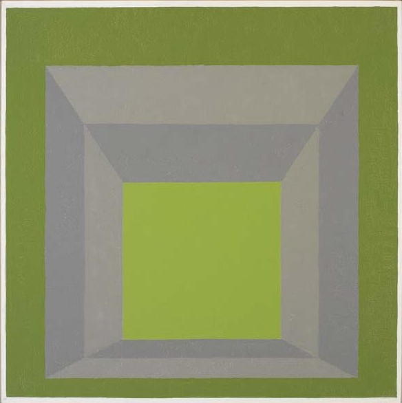
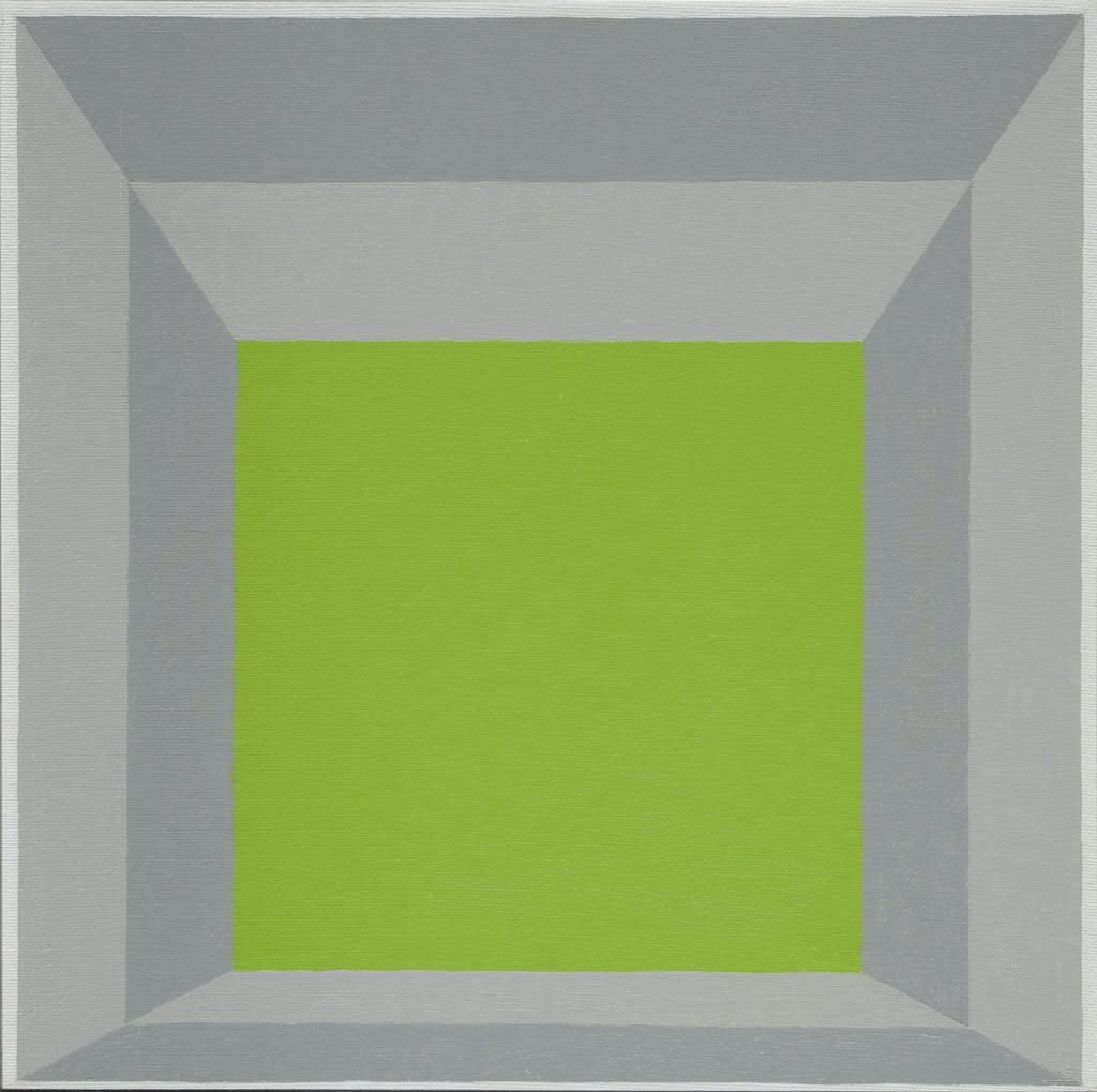
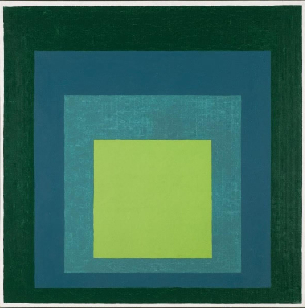
Let’s take a look at the closest colour to that of tennis balls in the art of Albers:
Josef was very aware that different manufacturers used the same name for colours that look very different. A Winsor & Newton Mars Yellow, for example, seems miles apart from a Grumbacher Mars Yellow. Adding to that, the way a colour looks when reproduced is different from the way it looks in a painted canvas.
Test your colour memory. In these Albers paintings, which of these colours do you think looks closer to a tennis ball?
These three and a half paintings all belong to Josef’s series called Homages to the Square, of which he painted nearly three thousand between the time that he turned sixty-two years old, in 1950, until his death at age eighty-eight, in 1976. They gave Josef a chance to create a vast range of “colour climates,” and they incite a range of sensations of movement in colours that were factually inert. The same Cinnabar Green Light, made by the paint manufacturer Old Holland, looks different according to its quantity – and thus its size in relation to the colours adjacent to it – and the light intensity and hue of the colours surrounding it. If you take a piece of white paper and fold it to size so that it blocks everything between two of the central squares of the paintings, you will see that they are almost exactly the same although they look dramatically different. (The variables that exist are because we are dealing with photographic reproduction, not the actual paintings.)
Everything makes a difference with colour; there are no absolutes. And in the case of the colour of tennis balls, there is yet another element – beyond the distance from which we see the ball, the degree of sunlight or shadow, the colour of the court that is in effect its background, and the nature of our own eyesight: the extent of our capacity to distinguish colours. It is the age and condition of the ball.
The artist Eddie Martinez pointed this out in a recent New York Times article:
I have painted tennis balls for at least five years. I don’t think I ever paint the color accurately. It’s a funky color. There is a whole debate over the color of tennis balls. Are they yellow or are they green? I think that every tennis ball shifts between that range in the course of their life. They start off neon, like a toxic sludge, but once a ball starts to lose its fuzz and pick up the residue of whatever surface you’re playing on, they get dull. I would say they start off neon green and go more toward yellow over time.
Maybe colours are like the word “color,” which is spelled differently in English English than in American English; there is no single fixed law. Is the difference between lemons and limes a matter of flavour or flavor?
Exalt in what you cannot know! Yes, once upon a time the colour of tennis balls was plain old coconut cake white (or angel food cake white, or a genoise; it depends on the state of the ball.) Then, thanks to David Attenborough, it was made easier for the eye to perceive. But let the “green or yellow?” debate go to the side; throw it out of the court. You never know for sure who will win the match, and in this case the winner is the colour itself, not its name.
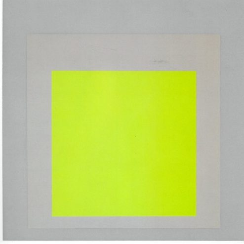
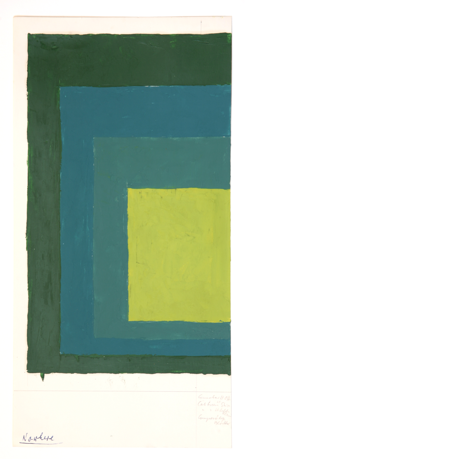
And then look at the print below by Josef Albers. He made it in 1969. Is this where the manufacturers of the new tennis balls got their idea? All we know for sure is that if we stare at the central colour – peu importe the name – for long enough, and then look at either of the greys surrounding it (warm grey, cool grey, but grey nonetheless,) we begin to get slight afterimages of the middle colour. Savour the thrill, or savor it; words are only words.
Story published in Courts no. 1, summer 2021.